Thursday 28 August 2014

GOOD DESIGN VS BAD DESIGN

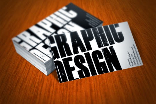
What I thought about a good design name card ? For me, it's has to be simple, creative, not too colorful, and straight-to-the-point. We have our own opinion in what and which design that captured our attention. Bad design isn't actually bad. Maybe just lack of something even I don't know what is it lacked of. Humans are a bit complicated isn't ? These are the design that I think it is good.


These are the opposite of it. But, the design is alright. It's OKAYYYYYY ~


Friday 22 August 2014

ZAC EFRON


Hello there ! Well, this is my first time editing pictures using Photoshop. Usually, I only use online editor or photo editor applications that I installed in my mobile phone. To me, it is easier to edit using those application. However, Photoshop has given me a new life now. It is definitely a super-duper editor. I REALLY LOVE IT ! It's like I am able to transform a beast into a prince charming; just making them look beautiful and amazing. And so, here's my first try-out. MY BEASTLY ZAC. He's so handsome that I can't barely transform him to something I want. Btw, I love the eyes. 

Thursday 14 August 2014

DESIGN PRINCIPLE WORKS

STEP 1 : SKETCHING
STEP 2 : DRAW OUTLINE
STEP 3 : COLORING
On our design principle's class, we required to make two artworks that consist the element of arts and principle of design. And so, these are some of my artworks that I have created. It takes 2 days for me to finished this. For the element of arts, I've used the LINE, SHAPE and COLOR. On the other hand, for the principle of design, I've used HARMONY, UNITY and REPETITION. That's all :)


Tuesday 12 August 2014

COMPANY LOGO


This is another new assignment for the past 2 weeks, making our own company logo. Since I love photography so much, I have decided to make my company logo; "MARINA SUEDA". I used my own name to create this logo. One day, I'm going to open a photography studio. Hopefully my dreams will comes true ! Bless you. 

Wednesday 6 August 2014

DIY LETTER I AND O


Another diy alphabets that I'm making during the raya breaks. I really miss my home XD Well since I'm home, I try and practice making this work. So, this is my letter "I" using serif font typeface and the letter "O" using the sans serif font. I make it using colored paper and then draw polkadots onto it. I believe that this design are suitable for children departments, candy shops, and also for the arts and crafts.