Showing posts with label Design Principle. Show all posts

Saturday, 4 October 2014

NAME CARD

Making my own name card. I'm making an event organizer's name card. I used pink and also others colorful color to make my name card more pleasant and attractive to the eyes of the people. When I think about an event organizer, I thought of the Alice in the Wonderland, the "Mad Hatter". I thought of balloons and hat. These is how my name card ended up.


Thursday, 28 August 2014

GOOD DESIGN VS BAD DESIGN

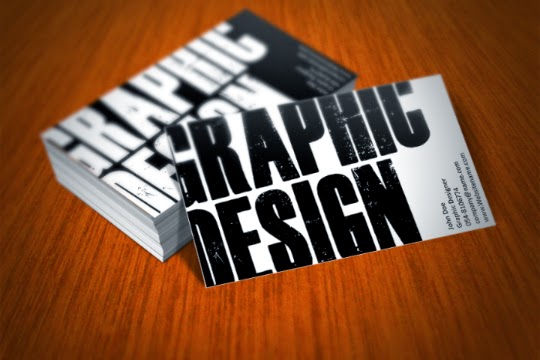
What I thought about a good design name card ? For me, it's has to be simple, creative, not too colorful, and straight-to-the-point. We have our own opinion in what and which design that captured our attention. Bad design isn't actually bad. Maybe just lack of something even I don't know what is it lacked of. Humans are a bit complicated isn't ? These are the design that I think it is good.


These are the opposite of it. But, the design is alright. It's OKAYYYYYY ~


Thursday, 14 August 2014

DESIGN PRINCIPLE WORKS

STEP 1 : SKETCHING
STEP 2 : DRAW OUTLINE
STEP 3 : COLORING
On our design principle's class, we required to make two artworks that consist the element of arts and principle of design. And so, these are some of my artworks that I have created. It takes 2 days for me to finished this. For the element of arts, I've used the LINE, SHAPE and COLOR. On the other hand, for the principle of design, I've used HARMONY, UNITY and REPETITION. That's all :)


Friday, 4 July 2014

ROY LICHTENSTEIN

"ROY LICHTENSTEIN'S ARTWORKS"

Roy Fox Lichtenstein
This is Roy Lichtenstein, who was an American pop artist. He was born on October 27th, 1923, and died on September 29th, 1997. His work defined the basic premise of pop art through parody. He favoring the comic strip as his main inspiration. Roy Lichtenstein produced hard-edged, precise compositions that documented while it parodied often in a humorous manner. His work was heavily influenced by both popular advertising and the comic book style. In my opinion, his artworks are very interesting. I really amazed on how he makes his artworks by using dots. These are the examples of his works, "Drowning Girl", and "Hopeless".

Roy Lichtenstein, Drowning Girl, 1963.
A painting with oil and synthetic polymer paint on canvas.

Roy Lichtenstein, Hopeless, 1963.
A painting with oil paint and acrylic paint on canvas.

YAYOI KUSAMA

"THE ARTWORKS OF YAYOI KUSAMA"

This is Yayoi Kusama-sensei
A unique Japanese artist, Yayoi Kusama-sensei is born on March 22, 1929. Throughout her career, she has worked in a wide variety of media, including painting, collage, sculpture, performance art and environmental installations, most of which exhibit her thematic interest in psychedelic colors, repetition and pattern. I really loves her artworks. How she used dots and applying such strong, happy, and wonderful colors onto her arts. It may looks simple but it's an amazing art piece ! 
  
Yayoi Kusama, Pumpkin, 1994
Yayoi Kusama, Dots Obsession, 1999


PRINCIPLES OF DESIGN


1. PATTERN - The repetition of the elements of art.

2. EMPHASIS (CONTRAST) - Focusing the main idea which "grabs" your or the viewer attention.

3. VARIETY - An assortment of lines, shapes, colors and other elements of art in the artwork.

4. UNITY - Combining the elements of art so that it can work together or fit together, thus the artwork looks complete.

5. BALANCE - A way of combining elements to add a feeling of equilibrium or stability to a work of art. Major types are symmetrical and asymmetrical.

6. RHYTHM & MOVEMENT - A regular repetition of the elements of art to create a sense of rhythm and movement. 
  • Rhythm - A principle of design that indicates movement, created by the careful placement of repeated elements in a work of art to cause a visual tempo or beat.
  • Movement - A principle of design used to create the look and feeling of action and to guide the viewer’s eye throughout the work of art.

7. PROPORTION - A principle of design that refers to the relationship of
certain elements to the whole and to each other.

ELEMENTS OF ART


1. LINE - An element of art defined by a point moving in space. Line may be two-or three-dimensional, descriptive, implied, or abstract. 

2. SHAPE - An element of art that is two-dimensional, flat or limited to height and width.

3. FORM - An element of art that is three-dimensional and encloses volume; includes height, width and depth (as in cube, sphere, pyramid or cylinder). Form may also be free flowing.

4. COLOR - An element of art made up of three properties: hue, value, and intensity.
• Hue: name of color;
• Value: hue’s lightness and darkness (a color’s value changes when white or black is added);
• Intensity: quality of brightness and purity (high intensity = color is strong and bright; low intensity = color is faint and dull).

5. TEXTURE - An element of art that refers to the way things feel, or look as if they might feel if touched.

6. SPACE - An element of art by which positive and negative areas are defined or a sense of depth achieved in a work of art.

7. VALUE - The lightness or darkness of tones or colors. White is the lightest value; black is the darkest. The value halfway between these extremes is called middle gray.

* DOT is the first element of art. The making of art started with dots then follows by line, shape, form, color & texture.